It's quite obvious that at the end of the day every marketer and salesperson want to sell their product and bring in a sizeable volume of customers on board.
Because no matter how massive your site visits are, or how good your product is, or how strategic and focused your Marketing Plan is, it basically boils down to urging those visitors, leads and customers to step into the next stage of the sales funnel… which eventually should result in – the visitors actually purchasing something from you.
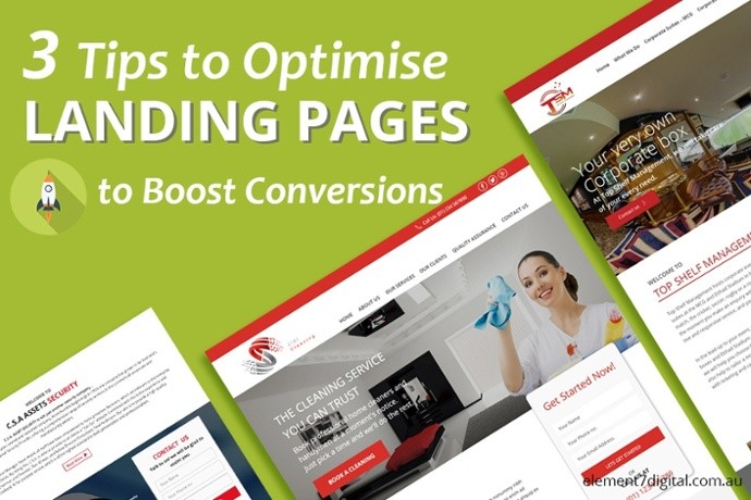
One likely culprit that could be hindering your chances of acquiring these customers could be your ‘unoptimised’ Landing Pages…
Yes these prospective customers could be simply ‘bouncing off’ your Landing Page, because it's not interesting, compelling, valuable or simply not ‘good enough’ for
them to opt in!
A well optimised Landing Page can work wonders when it comes to ‘Conversions’.
Take a look at a few stats below, which further elucidates the point:
- Companies see a 55% increase in leads when increasing their number of landing pages from 10 to 15. (HubSpot)
- A one second delay in page response can result in 7% reduction in conversions. (Kissmetrics)
- Using videos on landing pages can increase conversions by 86%. (eyeviewdigital)
- 80% of traffic goes to the top 10% of landing pages. (Searchengineland)
You must be quite aware by now that landing pages are ‘not the pages where you happen to land’.
You could land on different kind of webpages when you’re browsing, for instance, home pages, blog posts, white papers, product description pages, sales pages, etc.,
– but none of them are called ‘landing pages’
Here’s a legitimate definition from Copyblogger;
“A landing page is any page on your site where traffic is sent specifically to prompt a certain action or result.
Yes, unlike the types of pages I mentioned above, landing pages are there for one and only one reason – to persuade the visitor to take a specific action; ‘one page, one goal’. And every landing page comes with a form, which is put there solely to capture the visitor's information, and to engage the visitors further into the ‘buyers’ journey’, through appropriate stages in the sales funnel.
A landing page could be prompting users to:
- Sign up and Subscribe to Blogposts.
- Join to get the free trial offer.
- Sign up to download Free e-book.
- Purchase product at a discounted offer.
The list could go on… it's only limited to the marketer’s creativity and imagination!!!

Having said that, let’s explore some nifty tips to help optimise your landing pages for better conversions:
1. ‘Let them breathe’ – Use White Spaces
The last thing you’d want to do is to ‘tire’ your prospects by making them read through a ‘chocked up’ blocks of texts, lying close to each other, without any room to breathe.
Your visitors are most likely to give up reading your copy the as soon as they see the overburdened blob of texts. It's important to foresee the readers nowadays are more of a ‘skimmer’ and a quick ‘scanner’, they're being exceptionally adept at blasting through any content to capture the essential nuggets of information.
Making good use of white spaces at the left and right margins and between the paragraphs will make it easier on their eyes, rather than straining it with long and close-knit paragraphs.
An example of a landing page below from Apple shows us how it’s done;
When there are enough white spaces, the brain processes the information much easily and brings more clarity – enabling and comforting the visitor to make the immediate decision at hand i.e. taking the action to opt in, purchase, or essentially to ‘convert’.
2. The Minimalist Design – Stay Away From Multiple Offers
The point is clear here, if you like to confuse your visitors, then go with multiple offers and ‘unnecessary’ extras.
The minimalist approach focuses on ‘simplicity’ with ‘clarity of purpose’, whereas multiple offers tend to produce distractions. And to set the fact straight – Landing pages with multiple offers have been found to decrease conversions by 266%.
Let’s look at the example below from a Password Management service Mitro:
Here we have a ‘clutter free’ design, which is modern, simplistic and aesthetically pleasing. There are no ‘extra baits’ to confuse you with, as it comes with only one, highly focused and clear message which compels you to – Get Mitro!
And remember, there’s only one way out of this page, no distractions like any ‘home’ buttons or FAQs button.
The subtle tints of blue and green with the background and a contrasted CTA at the center, has been beautifully crafted to keep the visitors’ eye glued to the CTA, who are compelled to ‘click through’ to try the offer – hence the conversion!
3. Use Trust Signals – Adding ‘value’ to your product
Using ‘Trust Signals’ means you're basically placing the names of the companies/logos who have used your product/services – right on your landing pages. This display of companies and logos act as ‘social proof’ for the visitors, a positive ‘testimony’, in comparison to brands who ‘dig’ your product.
The subtle idea behind this technique is, a list of brands (big names give more leverage) are basically vouching for your product, and being the ‘human’ and a ‘social animal’ we are, we tend to get influenced easily with this exposé, and will most likely ‘give it a go’ thinking ‘if it’s good for them, it should be good for me too!”
Take a look at an example from Recurly below;

In this landing page, Recurly puts out a ‘display’ of prominent brands, that are already its customers. With big names such as LinkedIn, HubSpot, Adobe and Groupon, their landing page is sure to convince the ‘skeptics’, and would easily convert those visitors who are already on the brink, looking for that extra assurance.
If you'd like to take a snapshot of how you can optimise your landing pages, the following is a neat takeaway (infographic) from QuickSprout;

To Wrap Up…
‘Landing’ pages, if we look from the customers’ perspective are the ‘Beginning’ pages in the customers’ ‘journey’ with your products/services. There could be numerous ways to craft a compelling landing page, but successful optimisation is only possible if you put in the right research and work to ‘know’ your audiences (Personas), and build ‘trust’ with them, along with the persistence to constantly ‘test and tweak’ your pages for better results!
If you'd like more assistance with your content or would like to discuss anything covered today, we'd love to hear from you.
Call Andy Fox (me) on (03) 5249 5570 or email andy@element7digital.com.au
Our Website is element7digital.com.au